-
Overview
This project involved conducting a detailed Benchmarking analysis of the Alcampo.es website, comparing its UX/UI design with other online supermarket platforms. The analysis focused on identifying strengths, areas for improvement, and unique elements in key sections such as the homepage, category pages, product cards, and product detail pages.
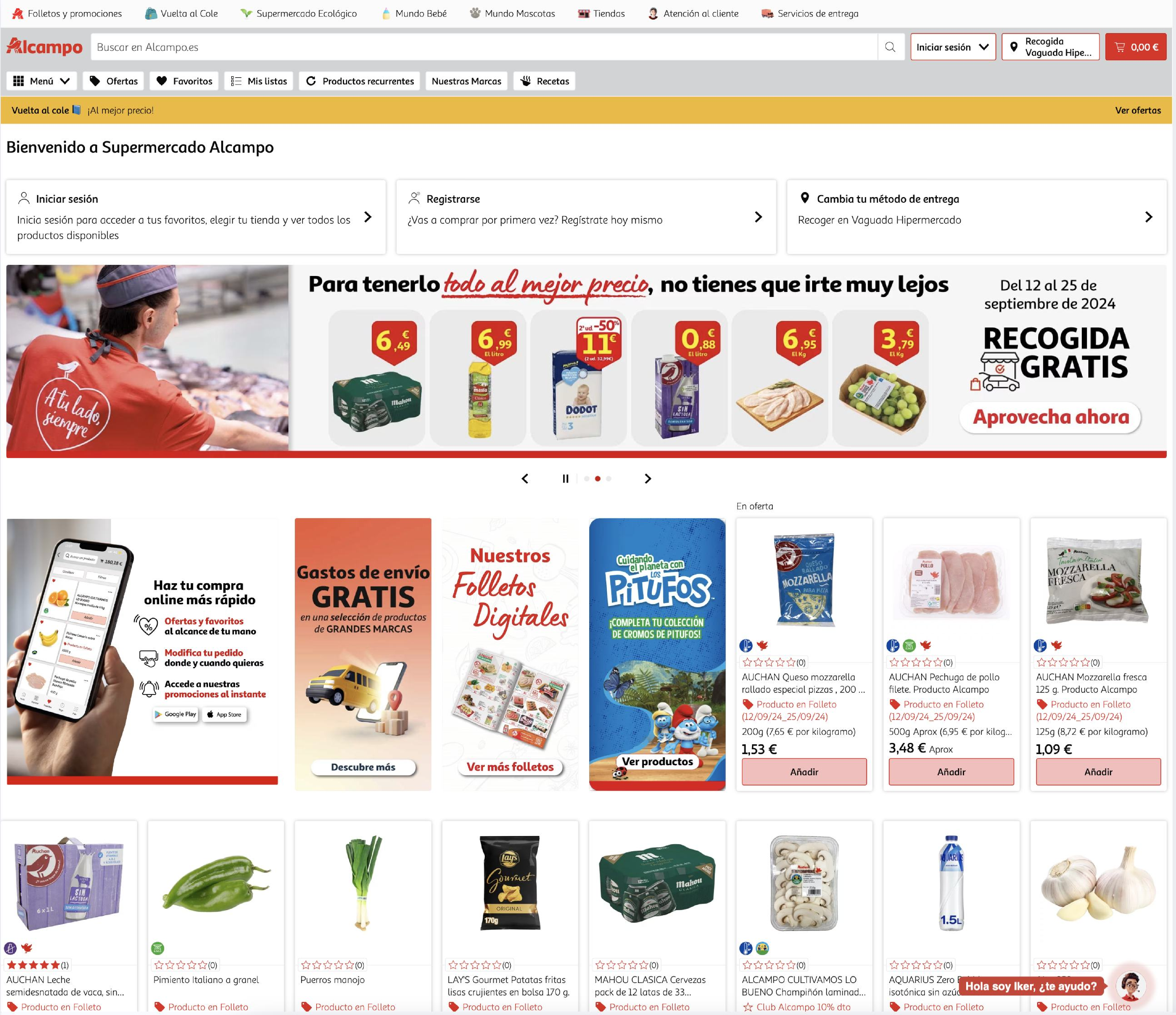
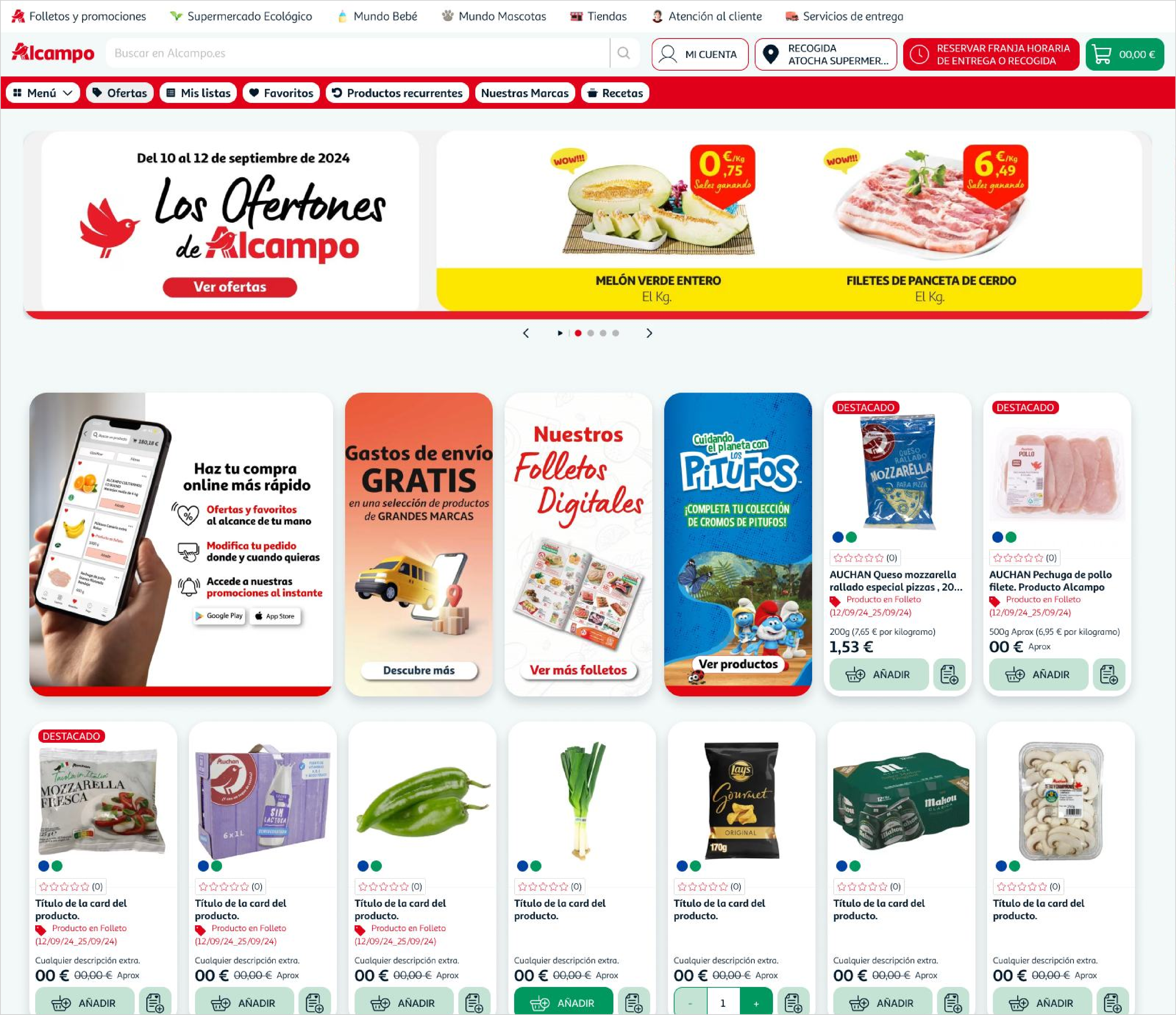
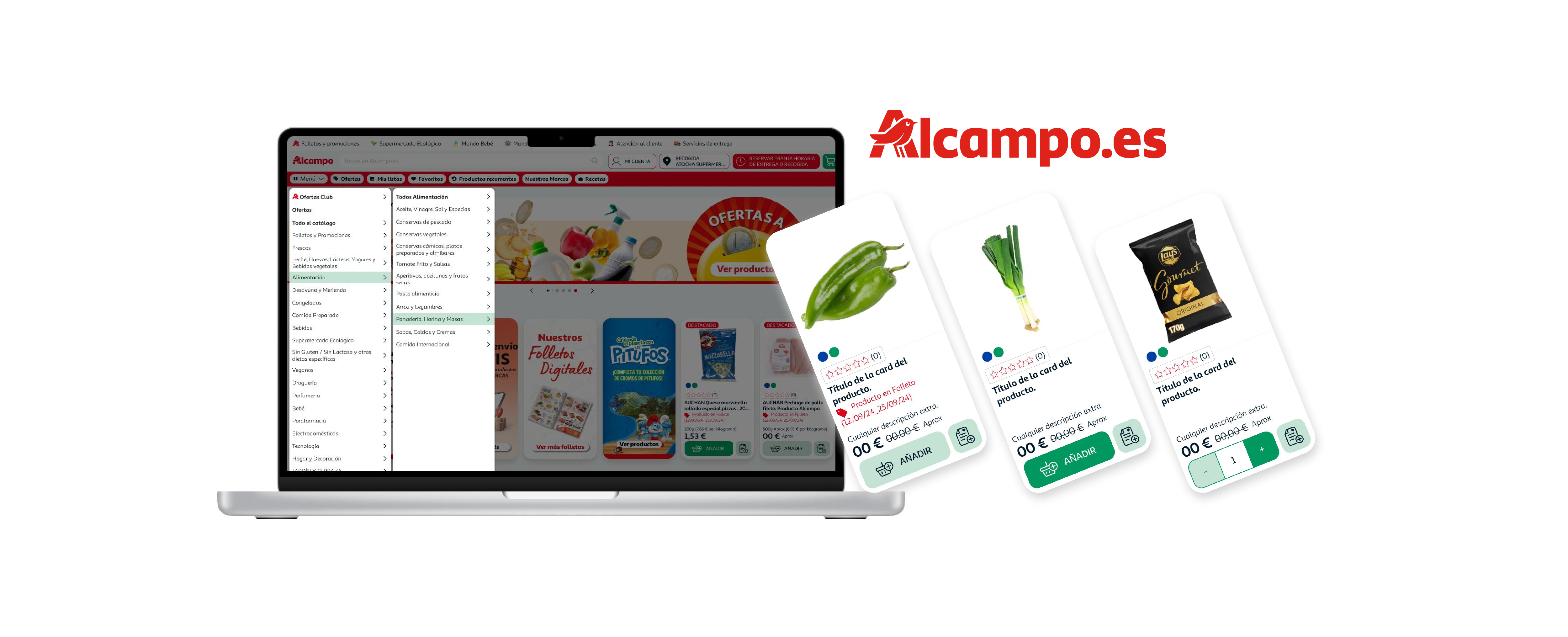
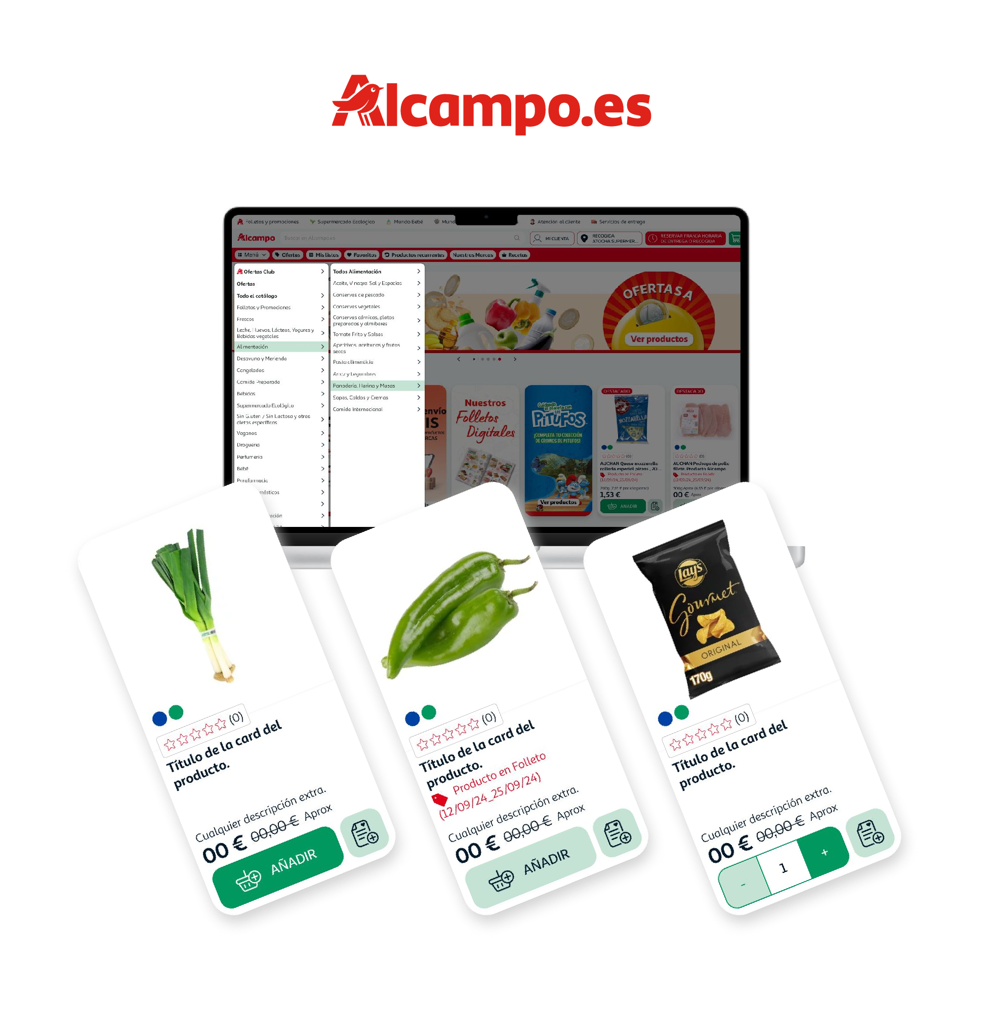
Following this, and in alignment with the recently updated brand book, I implemented a UI refresh that enhanced the website’s visual design. This included updates to colors, corner radii, shadows, and other styling elements to ensure better information hierarchy and improve the user’s perception of the site. The goal was to make impactful yet simple changes that elevated the brand’s digital presence without altering the core UX flows.
-
Tools
Figma, Figjam, Adobe Dreamwaver.
-
Scope
Benchmarking Analysis (UX/UI), Visual Redesign (UI), Brand Alignment, Design Execution.
As part of the project, a benchmarking analysis was conducted, comparing Alcampo.es with four other leading online supermarket platforms. The study focused on identifying strengths and weaknesses across four key areas:
- 1. Homepage – Overall structure, layout, and first impressions.
- 2. Category Menu – Navigation, accessibility, and usability.
- 3. Product Cards – Design, information hierarchy, and clarity.
- 4. Product Page – Detailed information display and user interaction elements.
This analysis provided a clear understanding of industry standards and best practices, as well as opportunities for improvement specific to Alcampo.es.
Conclusions and Quick Wins!
The benchmarking study and analysis of Alcampo.es revealed several opportunities to improve the user experience and align the design more closely with user expectations and industry standards. Among these, two quick wins stood out for their potential impact:
-
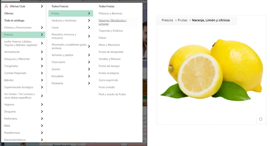
Breadcrumb Navigation
Implementing clear breadcrumb navigation ensures a well-defined user journey throughout the platform. This improvement offers the following benefits:· User Confidence: Helps users understand their location on the site, reducing uncertainty.
· Error Reduction: Simplifies navigation, making it easier to backtrack or move between sections.
· Transparency: Improves overall site usability by providing a clear visual path.
-
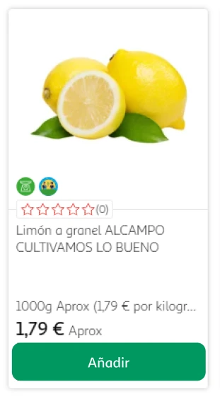
Button Color Adjustment
Changing the red "Add to Cart" button to a more positive and accessible color creates a subtle yet impactful enhancement. Benefits include:· Positive Perception: Shifting to a friendlier color fosters a more welcoming interaction.
· Consistency and Accessibility: Ensures the color aligns with the updated brand guidelines and is easier for all users to recognize, including those with visual impairments.
As part of the project, a benchmarking analysis was conducted, comparing Alcampo.es with four other leading online supermarket platforms. The study focused on identifying strengths and weaknesses across four key areas:
- 1. Homepage – Overall structure, layout, and first impressions.
- 2. Category Menu – Navigation, accessibility, and usability.
- 3. Product Cards – Design, information hierarchy, and clarity.
- 4. Product Page – Detailed information display and user interaction elements.
This analysis provided a clear understanding of industry standards and best practices, as well as opportunities for improvement specific to Alcampo.es.
Conclusions and Quick Wins!
The benchmarking study and analysis of Alcampo.es revealed several opportunities to improve the user experience and align the design more closely with user expectations and industry standards. Among these, two quick wins stood out for their potential impact:
-
Breadcrumb Navigation
Implementing clear breadcrumb navigation ensures a well-defined user journey throughout the platform. This improvement offers the following benefits:· User Confidence: Helps users understand their location on the site, reducing uncertainty.
· Error Reduction: Simplifies navigation, making it easier to backtrack or move between sections.
· Transparency: Improves overall site usability by providing a clear visual path.

-
Button Color Adjustment
Changing the red "Add to Cart" button to a more positive and accessible color creates a subtle yet impactful enhancement. Benefits include:· Positive Perception: Shifting to a friendlier color fosters a more welcoming interaction.
· Consistency and Accessibility: Ensures the color aligns with the updated brand guidelines and is easier for all users to recognize, including those with visual impairments.

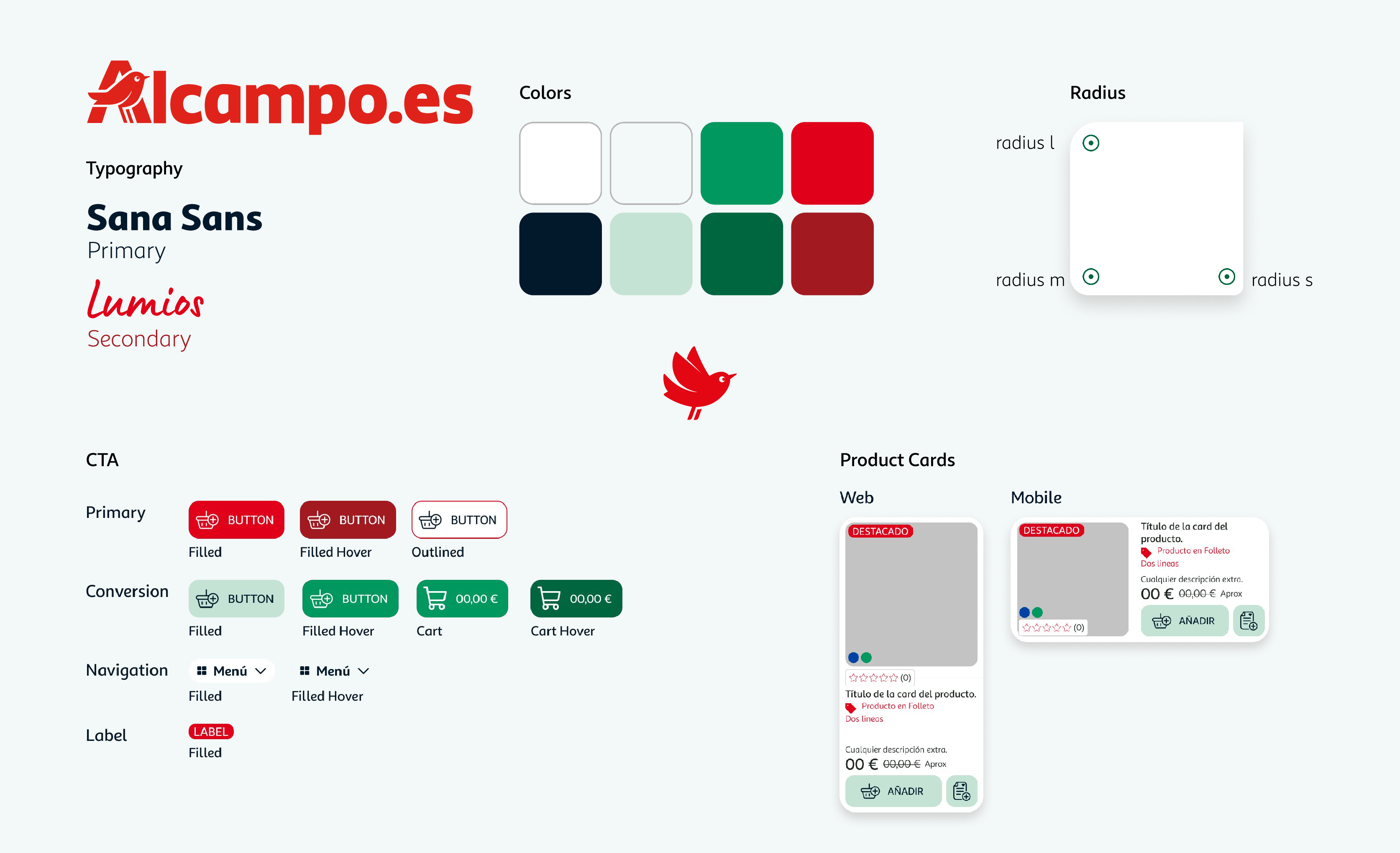
Current vs proposed page


Current vs proposed page
