-
Overview
Onyric is a board game set in Ancient Egypt, based on the idea of dreams as premonitions. The idea of this project comes from wanting to create something enjoyable to share with my friends and family, as we all love spending time together playing board games.
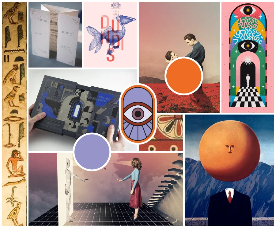
I was clear that the theme of the game would revolve around dreams, because of how the onyric world has always intrigued me. And that’s where the name originated. This project evolved with some references from artists like Julien Pacaud and my favorite board games: Mysterium and Codenames. Mysterium served as inspiration for the storytelling and product design of Onyric, while the game also takes the versatility and quick grasp of Codenames.
I didn’t want to settle for just designing the packaging or the visual identity of the game. I wanted to immerse myself in the process and experience of designing a board game from start to finish. Through Onyric, I aimed to offer a kind of appreciation to those designers who create quality moments with our loved ones.
-
Tools
Adobe Illustrator, Photoshop, Indesign, KeyShot, AutoCad.
-
Scope
Branding, Storytelling Creative Process, Visual Identity, Development of pictograms in grid, Study of typography, Study of colours and development in duotone, Preparation of files for printing, Product rendering.
The game
We are set in Ancient Egypt, and the Pharaoh is in danger of death. The gods have spoken in his dreams, announcing a dire fate for him. But like any great leader, he does not give up in the face of adversity, and seeks the help of his Spiritual Advisors to avert his tragic end.
I didn’t want to settle for just designing the packaging or the visual identity of the game. I wanted to immerse myself in the process and experience of designing a board game from start to finish. Through Onyric, I aimed to offer a kind of appreciation to those designers who create quality moments with our loved ones.
Creative Process
-
Moodboard

-
Visual Identity
The final logo was created based on a series of pictograms I designed after working on iconography about the phases of sleep. Since initially the game was going to be based on the world of dreams, these phases would be represented through an eye, a symbol often associated with the mysticism.
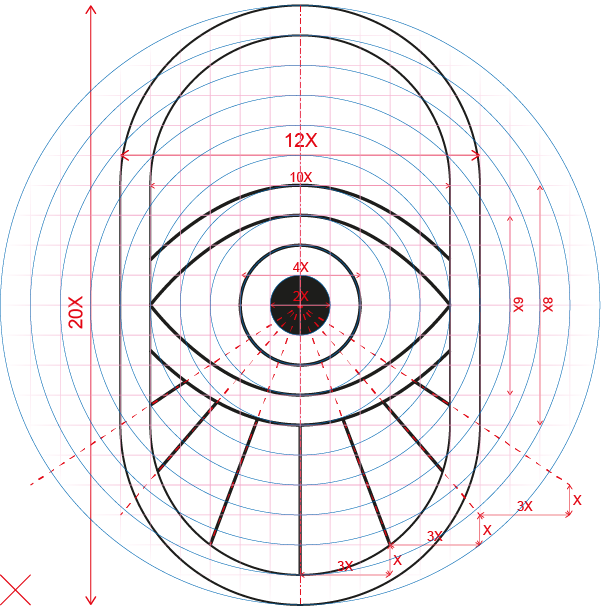
Regarding the shape that encompasses it and the design style, I was drawn to creating a pragmatic, enclosed form with solid and clear lines. Initially, as seen in the sketches, it started as a circle, but elongating it vertically gave me the feeling of providing with more stability.
'Click' in the image to see the grid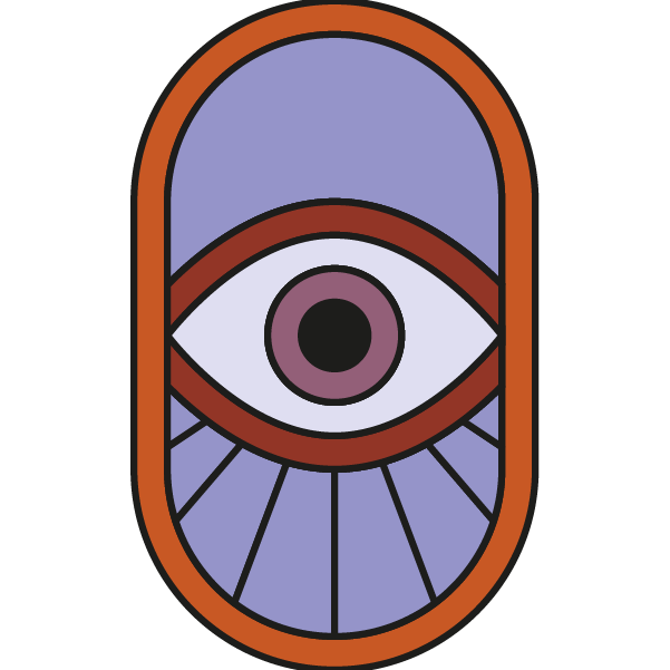
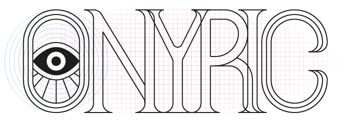
When the logo was created (isotype), and having the name of the game, I felt the need to design a logotype or imagotype (depending on whether it is used with the isotype or not). As it was a board game, the pictographic element was not enough to attract the public's attention and make them keep the name.
Based on the grid, I created letter after letter of a Serif typeface.
'Click' in the image to see the grid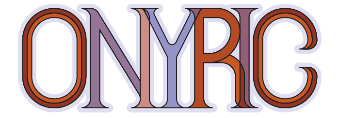
-
Colors
The color palette emerged alongside my curiosity about duotone with Pantone. I was looking for two colors with personality. On one hand, a bright orange (Pantone 1585 C), and on the other, a delicate violet (Pantone 271 C).
This chromatic and temperature contrast between the two colors gave me the opportunity to create a palette full of personality, ranging from tones full of strength and passion to others more melancholic and delicate.
Pantone 271 CPantone 1585 C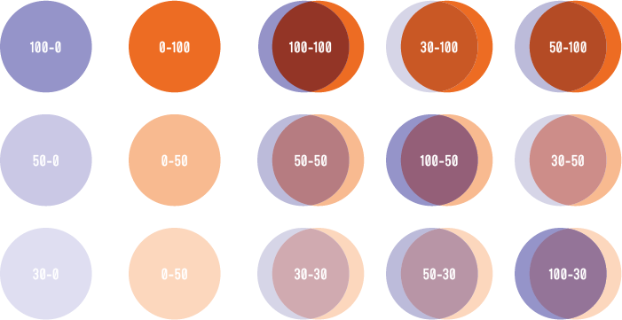
-
Typography
Having to create large sections of text (especially for the rules booklet), the need arose to find a typeface in keeping with the design.
What I was looking for was, above all, legibility and contrast with the typeface of the logotype. Therefore, I started looking for a sans serif typeface. To narrow down the search, a key requirement was the shape of the O: as close to the outline of the isotype as possible.
The Mohave typeface fulfils this. In addition, the large number of typographic variables gave me a lot of freedom when drafting the rulebook.
Product
-
Cards
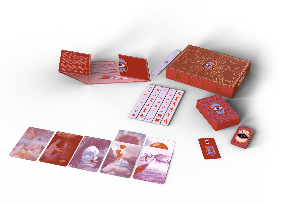
- Dream Cards
- Board Pieces
- Oracle Card
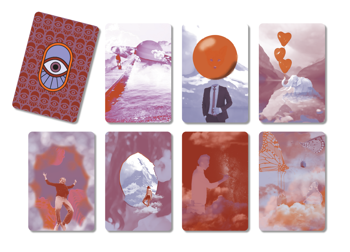
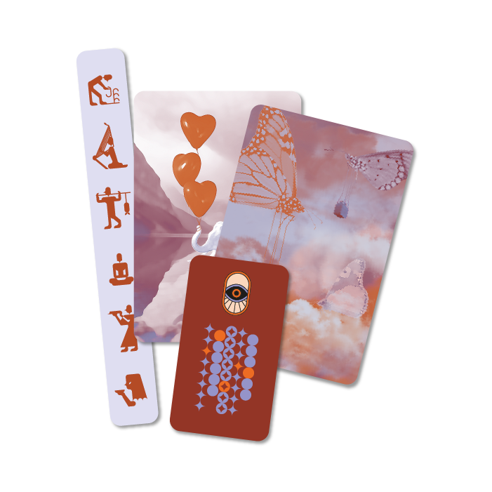
These cards were one of the elements that I had clear almost from the beginning of the process. With references such as Julian Pecaud, René Magritte, and the board game Mysterium, I knew I wanted to create cards with surrealistic images that evoke the dream world.
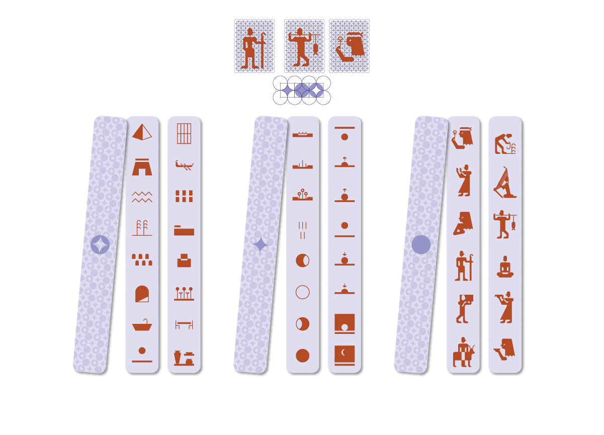
The Board Pieces brings dynamism to the game, and represent the moment, the person, and the place of the case. These variables are displayed on the front of the pieces as icons, with dark colors on a clear, smooth background to enhance readability. The shape of the Board Pieces, their placement, and the vertically arranged iconography are inspired by Ancient Egyptian inscriptions.
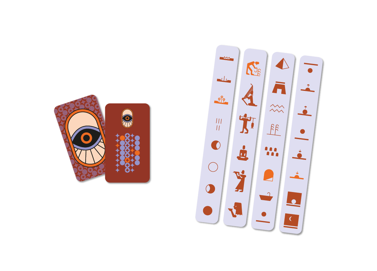
The Oracle Card can only be seen by the Pharaoh and serves as the connection point between the Board Pieces and the Dream Cards. It reveals the solution to the case.
-
Packaging
The game packaging is structured in three parts, each containing the previous one: the tray, the box, and the case.
The box, which holds the bed, has the detail of the pattern hidden inside, as does the case, which embraces the entire product.
The final package, the case, consists of two boxes that slide, like curtains, to reveal the rulebook and the product.
To contrast with the matte paper of the case, its top and two sides are decorated with a design in hot foil stamping. This way, the case also conveys the effect of Egyptian treasure.
The final touch is the logo, which emerges in a second layer where the two case boxes meet.

